Custom Charts Report
Chart Types
Reports, Charts, Templates, CQL & Export for Confluence supports three chart types, each suited to different data and insights.
Bar Chart
Compares grouped values using horizontal or vertical bars. Best for comparing quantities across distinct categories.
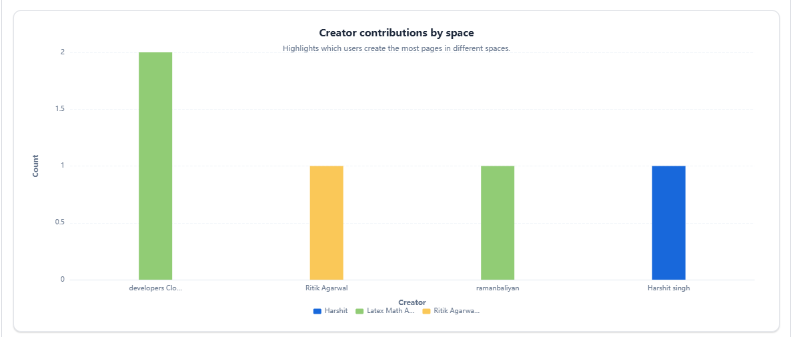
Best For
- Pages per space - compare space sizes by page volume
- Top editors - rank users by update count
- Label usage - see which labels are most/least used
- Active spaces ranking - most updated spaces in a period
Variants
- Simple bar - one bar per group (single metric)
- Stacked bar - bars broken into sub-segments by a secondary grouping (e.g., pages vs blogs per space)
Pie Chart
Shows distribution as slices of a whole. Best for understanding composition or percentage split of content.
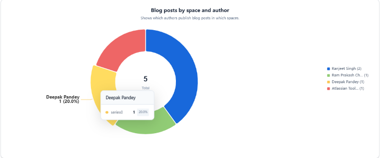
Best For
- Content type mix - page vs blog vs comment share
- Likes distribution - liked vs not liked
- Status distribution - current vs archived
- Attachment file type breakdown - PDF vs PNG vs DOCX
Line Chart
Shows change over time using a connected line. Best for tracking growth, trends, or activity spikes across a time axis.
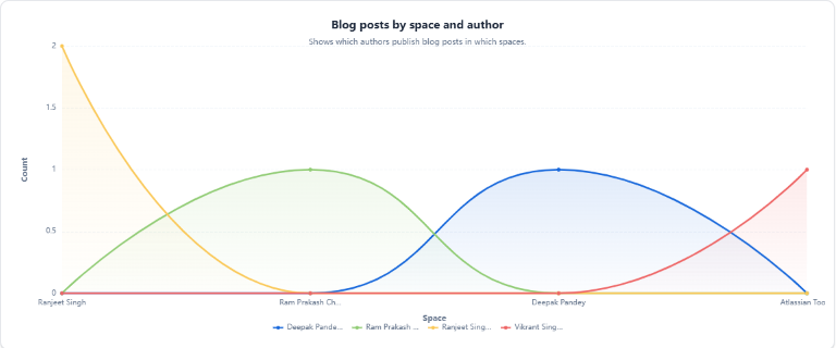
Best For
- Pages created over time - track content growth by month
- Pages updated over time - track maintenance activity
- Daily page activity by space - spot adoption or project spikes
- Comments trend - measure discussion engagement over time
- Blog publishing cadence - communications activity trend
Choosing the Right Chart
| Question to Answer | Recommended Chart |
|---|---|
| How many [X] per [category]? | Bar Chart |
| What is the split/composition of [X]? | Pie Chart |
| How has [X] changed over time? | Line Chart |
| Who are the top [contributors/editors]? | Bar Chart |
| Which spaces are most/least active? | Bar Chart |
| What percentage is [type A] vs [type B]? | Pie Chart |