Report Views
Reports, Charts, Templates, CQL & Export for Confluence supports five display formats. Choose the view that best matches how you want to present your data.
| View | Description | Best For | Pagination |
|---|---|---|---|
| Table | Rows and columns - spreadsheet-style layout | Audits, governance, structured data | Yes |
| List | One card/row per record - simple vertical list | Page indexes, quick inventories | Yes |
| Paragraph | Flowing prose - each record becomes a text block | Weekly digests, executive summaries | No |
| Grid | Card layout in a responsive grid | Team directories, visual dashboards | Yes |
| Charts | Bar, pie, or line charts | Trend analysis, distribution insights | No |
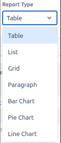
Table View
The default and most versatile view. Displays data in rows and columns. Best for comparing values across multiple fields.
Key Features
- Column headers defined by your Columns tab configuration
- Sortable columns - click header to sort ascending/descending
- Pagination - control result limit and navigate pages
- CSV and JSON export available
List View
Shows results as a simple vertical list - one item per row, minimal layout. Ideal for readable, human-friendly output.
Key Features
- Card-based layout - each record occupies its own row
- Field labels shown inline for readability
- Supports Image block - great for profile pictures or thumbnails
- Link block creates clickable items directly in the list
- Pagination supported
Paragraph View
Renders output as flowing prose. Each record generates a paragraph using your column template. Ideal for status updates, summaries, and narrative reports.
Key Features
- Prose output - reads as natural text, not a table
- Columns act as text segments that are concatenated
- Prefix and suffix settings (Text block type) add connective words
- No pagination - all records rendered sequentially
Grid View
Displays records as a responsive card grid - like a gallery. Ideal for visual content, team directories with photos, or dashboard-style pages.
Key Features
- Responsive multi-column grid layout
- Image block renders prominently in each card
- Link block makes card titles or images clickable
- Pagination supported
Charts View
Visualizes data with bar, pie, or line charts. Configured separately via the Charts section. Use when you want analytics and trends rather than raw records.
Switching Between Views
Change the Report Type from the dropdown in the header. The Live Preview updates instantly - no data reload needed.
Note: Column configuration is shared across Table, List, Paragraph, and Grid views. Charts use a separate axis/series configuration.