Advanced Cards Macro
What It Does
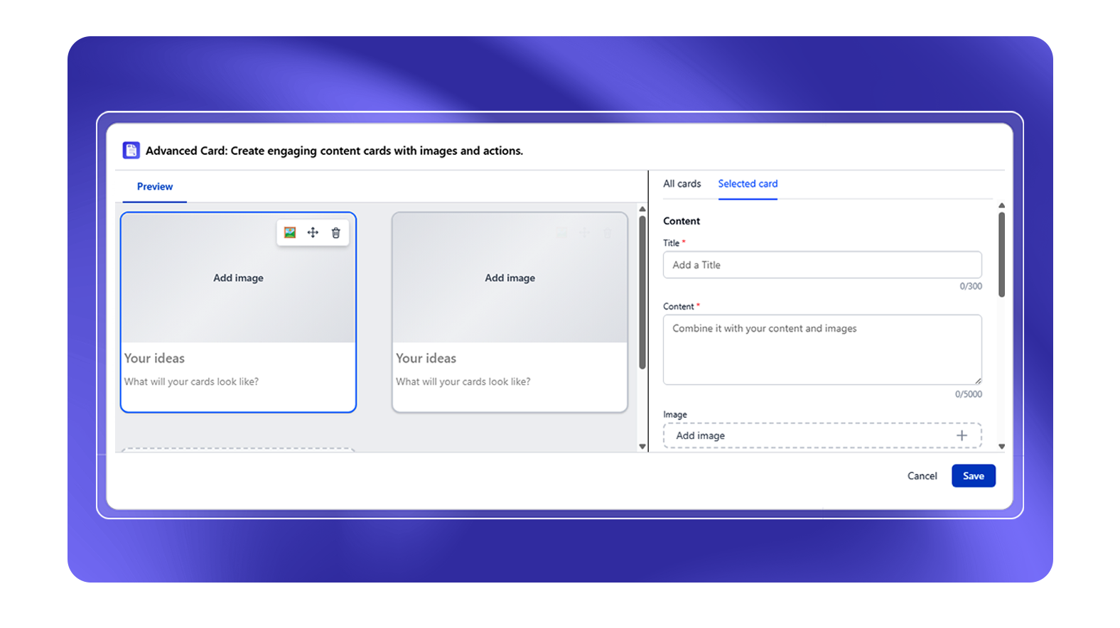
The Advanced Cards macro creates structured content cards - rectangular panels with optional header, body text, image, and link. Cards can be arranged in grid layouts to create visual hub pages.
Card Layout Options
| Columns | Description |
|---|
| 1 | Full-width single card per row |
| 2 | Two cards per row |
| 3 | Three cards per row |
| 4 | Four cards per row |
| 5 | Five cards per row |
Per-Card Configuration
| Setting | Description |
|---|
| Title | Card header text (required) |
| Content | Body text content |
| Image | Upload a Confluence attachment image |
| Destination | Link to a Confluence page (search) or external URL |
| Open in new tab | Yes / No |
| Background color | Color picker |
| Text color | Color picker |
Layout and Design Options
| Setting | Options |
|---|
| Image position | Left, Top, Bottom, Right, None |
| Image fit | Cover, Contain, Fill |
| Custom card height | Toggle + height input (100–800px) |
| Text alignment | Left, Center, Right |
| Hide card border | Toggle |
| Title size | 8–72px |
| Content size | 8–48px |
| Card spacing | Slider |
Common Use Cases
- Space home page: Cards for each team, product, or topic area - each card links to a sub-space or page
- Product catalog: One card per product with logo, description, and "Learn More" button
- Team directory: Cards for each team member with photo, name, and role
- Resources hub: Cards linking to key documents, forms, or systems