Divider Macro
Divider Macro
What It Does
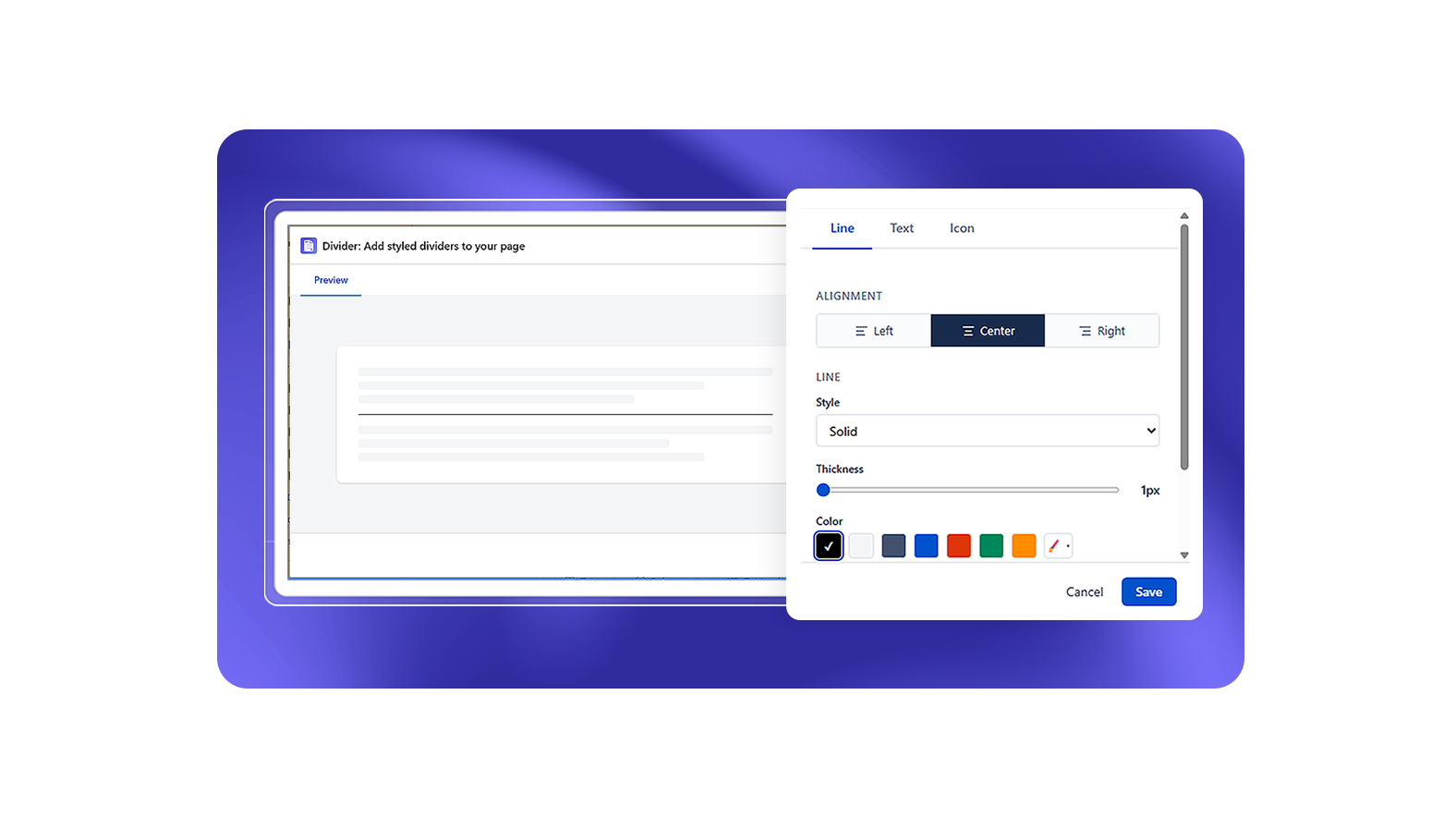
The Divider macro inserts a styled horizontal separator between page sections. It goes beyond the standard Confluence horizontal rule with multiple visual styles and spacing options.
Three Divider Types
Line
A styled horizontal rule. Choose a line style (Solid, Dashed, Dotted, Double, or Gradient), set the color, thickness, and width.
Text
A divider with a centered or aligned text label. Configure the label text (max 30 characters), label style (Plain, Badge, Uppercase), text color, font size, and font weight. A line appears on either side of the label.
Icon
A divider with an icon from the built-in icon library. Choose the icon, size (S/M/L), and the accompanying line style and width.
Configuration Options
All three types share these base settings:
| Setting | Options |
|---|---|
| Type | Line, Text, Icon |
| Line style | Solid, Dashed, Dotted, Double, Gradient |
| Color | Color picker or custom hex |
| Thickness | Slider |
| Width | Full width toggle; or percentage slider when not full width |
| Alignment | Left, Center, Right |
Additional settings for Text type:
| Setting | Options |
|---|---|
| Label text | Free text (max 30 characters, required) |
| Label style | Plain, Badge, Uppercase |
| Text color | Color picker |
| Font size | Slider |
| Font weight | Light, Regular, Bold |
Additional settings for Icon type:
| Setting | Options |
|---|---|
| Icon | From built-in Lucide icon library |
| Icon size | S, M, L |
When to Use
- Between major sections of a long page where a heading alone isn't enough visual separation
- In cards or background sections to separate a header from body content
- As a footer separator before contact information or navigation buttons